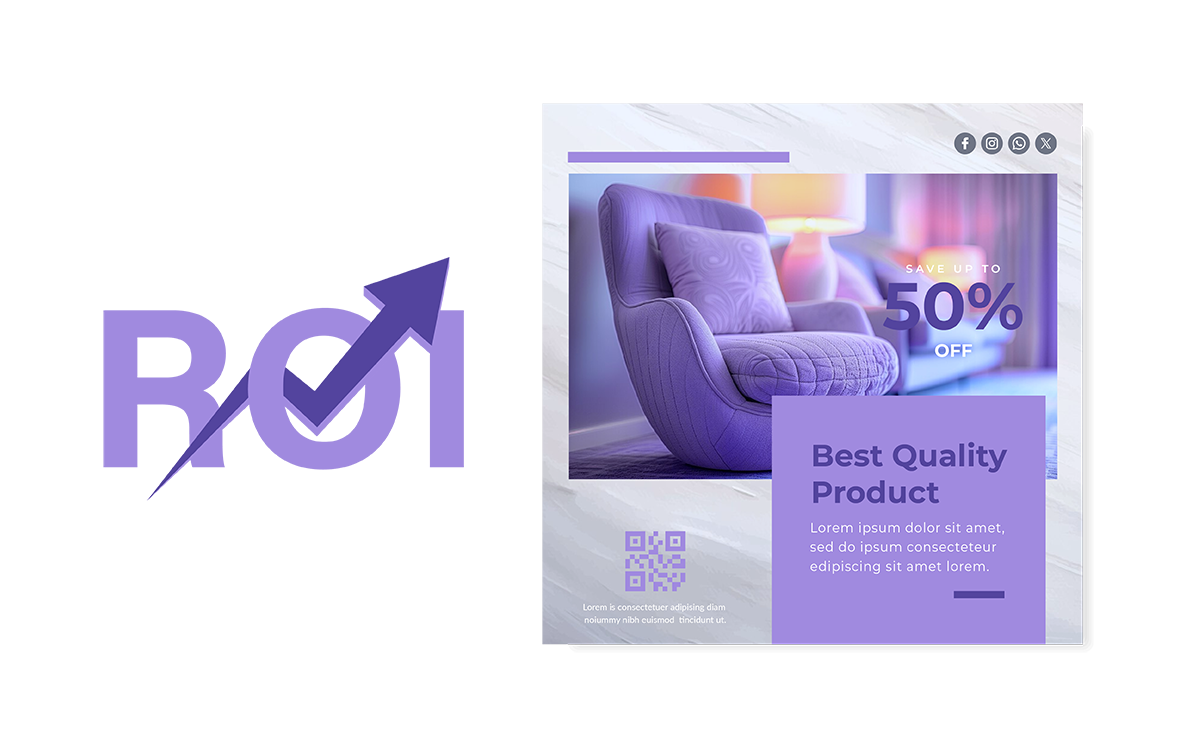
6 great tips to create polished social media designs

In the crowded landscape of social media, your content has mere milliseconds to capture attention before a user scrolls past. Whether you are a small business owner, a marketing professional, or a personal brand, the visual quality of your posts is often the deciding factor between a swipe and a stop. A polished design builds trust, communicates professionalism, and reinforces your message instantly.
Creating high-impact graphics doesn’t necessarily require a degree in fine arts or expensive software. By adhering to a few fundamental design principles and leveraging modern tools, you can elevate your social media presence significantly. So, here are some great tips for creating social media designs that look professional and engaging.
Use high-quality visuals
The foundation of any great design is the quality of its imagery. Blurry, pixelated, or poorly lit photos are an immediate turn-off and can make your brand appear amateurish. In the high-definition world of modern smartphones and retina displays, there is no excuse for low-resolution graphics.
Always aim for crisp, clear images. If you are taking your own photos, ensure you have adequate lighting and that your subject is in sharp focus. If you rely on stock photography, avoid the clichéd, overly staged images that look artificial. Instead, opt for authentic, candid-style shots that resonate with your audience. Remember, the visual is the hook; if it isn’t sharp and appealing, the caption won’t matter because no one will read it.
Maintain brand consistency
A polished social media feed should look like it belongs to a single, cohesive entity. Randomly changing colors, fonts, and vibes from post to post confuses your audience and dilutes your brand identity. Consistency is the key to recognition.
Establish a style guide for your social media. Choose a specific color palette of two to four colors that align with your logo and use them religiously. Select a pair of fonts; one for headlines and one for body text, and stick to them. Even the mood of your images should be consistent. If your brand is bright and energetic, a dark, moody photo will feel out of place. When your audience sees a post, they should recognize it as yours before they even see your handle.
Use a background remover tool
One of the quickest ways to make a design look custom and professional is to isolate your subject. A cluttered background can distract from the product or person you are trying to feature. This is where an AI background remover tool becomes a vital asset in your design arsenal.
By removing the background, you can place your subject on a clean, solid color or a subtle texture that aligns with your brand palette. This technique creates a pop-out effect that is highly effective for product showcases, YouTube thumbnails, or quote posts featuring a speaker. Modern design platforms often include AI-powered background removers that can do this in a single click, allowing you to layer text behind or around your subject for a sophisticated, magazine-style look.
Keep text clear and concise
Social media is consumed on mobile screens, often while users are on the go. This means your text needs to be instantly readable. Overloading a graphic with paragraphs of text is a design sin; it looks cluttered and is difficult to read on a small device.
It is better to adopt the less is more philosophy. Use your design to highlight the headline or the most critical piece of information, and relegate the details to the caption. Ensure there is high contrast between your text and the background. For example, white text on a pale yellow background is invisible. Also make sure there is hierarchy in your typography. So, your main message should be the largest element, guiding the viewer’s eye exactly where you want it to go.
Use templates for efficiency
Starting from a blank canvas every time you need to post is not only time-consuming but also leads to inconsistency. Using templates is a smart strategy for maintaining quality while speeding up your workflow.
Social media post templates provide a structural framework that ensures your margins, alignment, and hierarchy are already polished before you even start editing. You can create your own master templates for different types of posts, such as testimonials, sales announcements, or educational tips. Then, simply swap out the text and images as needed. This ensures that even when you are in a rush, your output remains high-quality and on-brand.
Incorporate negative space strategically
New designers often feel the urge to fill every empty pixel of a canvas, fearing that empty space looks boring. In reality, negative space is what makes a design look premium and readable.
Whitespace gives your visual elements room to breathe. It separates text from images, prevents the design from feeling claustrophobic, and directs the viewer’s focus to the focal point. Don’t crowd your elements to the edges of the frame; leave generous margins. A clean design with plenty of open space suggests sophistication and confidence, whereas a cluttered design feels chaotic and loud.
By prioritizing high-quality assets, leveraging smart tools like background removers, and embracing the elegance of whitespace, you can transform your social media feed. Consistency and clarity are your best tools for turning casual scrollers into loyal followers.
